The idea that I’m running with here is simple. I use my iPad a ton. It gives me the OS/ Apps/ experience that I’ve grown to love and be really productive with. I’m really liking having some other mobile OS to learn on my phone. If I get a chance I’ll be continuing this on an Android phone as well.
2 weeks into The Windows Phone 7 OS project… It’s nice. The OS is simple and way different than previous versions of Windows mobile OS. Microsoft really forced themselves to think different. So it’s different than previous versions of Windows mobile, but not a great deal different than other Smart Phones iOS’s. If this is your first stab into the Smart Phone world, I think most folks would be VERY pleased. It’s clean, quick, and very simple. Apps are pretty easy to install. I like the dynamic tiles design, the multitouch, the swiping action.
.
go back.
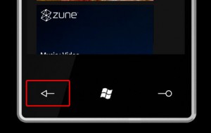
I’m really digging the physical “back” button. Naturally, the back button takes you back to the previous screen. However, the cool thing is that it works between different Apps and different screens inside of apps. So when I prematurely close a “window” (which I do quite often) or app, I can quickly get back to where I was. If I was typing something, it’s still there. I’m finding it to be really nice.
.
things I don’t like.
With this process I’m finding it pretty easy to identify things I don’t like. Or things I like better on the iPhone. I definitely am getting the feeling that this is the first version of the OS. This is kind of a shame. The Windows Phone 7 development team had an advantage. I’m sure they tore apart the Android and iPhone OS… Why not come out with the simple things out of the gate? Where they not that important, or were they overlooked? Or just too hard to do? Nope, can’t use that one because the other OS’s are doing them. Here is a list of things that I don’t like about the Windows Phone 7 OS:
- Copy and Paste – it’s currently not there. That’s a shame.
- Visual voice mail – nada. going back and listening to the AT&T voicemail system stinks. Press and hold 1 on the key pad… are you kidding me?!?!
- Alternating colors in SMS text messages (with the person you are texting). Yours and theirs are all the same color…
- Consolidated email – all of my email accounts (Live@edu, hotmail, gmail, University, .mac) are on the phone, but all on different tiles. I’d rather go to one tile called “email” then go to different accounts from there…
- I miss multi lined previews of email messages
- the People tile is not fully functional – twitter integration should at least be an option.
- Secondary email calendars do not seem to be viewable… not good.
- I miss the 2 sided cameras. not sure yet on the camera quality… seems to be ok. I miss Face Time.
- contacts lose naming often. from recent calls, only the numbers show even though the numbers are matched with names in my contacts.
- Bluetooth is shady. It simply will not connect with my handsfree bluetooth system in my car. Not cool.
- Only 6 IE browser windows can be open. If you need another, you have to delete or close a browser window. kind of limiting when multitasking.
More to come in my third and probably final post in this series. I’ll be reserving my over judgment on the whether to purchase or not for that final post.
